Start with what the audience needs to understand
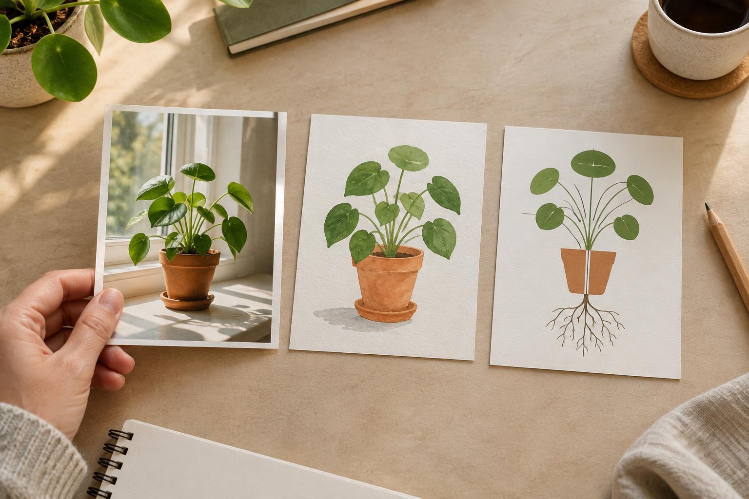
Before choosing a visual style, finish this sentence: “After seeing this, the audience should understand…” The answer might be what an object looks like, how an experience feels, why two things differ, or what happens first in a process. Each goal asks something different of an image. A photo can show a specific example; an illustration can make an idea easier to picture; a diagram can organize parts and relationships.
Consider where the visual will appear, too. A small social post may need one clear point rather than a detailed explanation. A longer article can give readers space to examine labels and refer back to the text. If a visual needs a long caption just to make its basic meaning clear, either simplify it or use another format. The best choice is not necessarily the most striking image; it is the one that reduces the audience’s work.
Use photos to show a real example
Choose a photo when specific, observable details matter. A photo can help readers recognize a tool, see the texture of a material, compare a workspace before and after a change, or understand how a person uses an object. It can also bring a human setting to a story that would otherwise feel abstract. For a guide to arranging a small filming space, a photo of an actual setup may answer questions that a polished illustration would leave open.
Photos carry details you may not intend to emphasize. A cluttered background, unusual lighting, or highly staged pose can distract from the lesson or imply that the example is the only acceptable way to do something. Crop and frame deliberately, and explain which details readers should notice. If you are showing a repeatable technique, consider whether one photo is enough or whether a short sequence would make the steps clearer.
Use illustrations to simplify or imagine
An illustration is useful when the idea has no obvious physical form, or when a real scene would introduce too much noise. You might illustrate the feeling of joining a welcoming online community, or show a simplified view of a busy interface without copying every button. Illustration lets you control emphasis: color, scale, and shape can direct attention to the idea you want readers to remember.
That flexibility comes with a responsibility to stay clear. A symbolic image may be engaging but still leave viewers unsure what it means. Give abstract illustrations a nearby sentence that names the point, and use consistent visual cues when an idea appears across several posts. If accuracy matters more than mood, avoid making a simplified drawing look like a literal record of an object, place, or result.
Use diagrams to show how parts connect
Choose a diagram when the main question is about order, structure, comparison, or cause and effect. A flowchart can show how an idea moves from draft to publication; a labeled layout can identify parts of a setup; a side-by-side diagram can clarify the difference between two approaches. Unlike a decorative image, a diagram should let readers trace a path or find an answer.
Build the diagram around one question. Put the most important labels close to the parts they describe, use arrows only when direction matters, and remove branches that do not help answer that question. Test it at the size people will actually see. If labels become unreadable on a phone, split the diagram into smaller panels or move supporting detail into the accompanying text. Color can reinforce meaning, but labels should carry it as well.
Make the choice, then check the result
A practical decision starts with a rough sentence and a quick sketch. Ask: Do readers need to see what something really looks like? Try a photo. Do they need a simplified or imagined representation? Try an illustration. Do they need to follow connections or steps? Try a diagram. Some topics benefit from a combination: a photo can establish the real-world example, while a small diagram points out the relationship that is hard to see at a glance.
Finally, check whether the visual works without relying on decoration or guesswork. Show it to someone unfamiliar with the draft and ask what they think it explains. Revise any misleading emphasis, and make sure the surrounding text states the key takeaway. Where the format allows it, add alternative text that communicates the visual’s useful information rather than simply naming its style. A good visual choice helps more people reach the same understanding, even if they encounter the image in different ways.